

Preface
This article is the first in a series. In this first instalment, we walk through some relevant background, the 'why' of data visualisation, what tools you might want to use, and then outline the basic set of plot types worth having in mind, and when you would most likely wish to employ them.
Introduction
Remote Sensing, Physical Phenomena, and Your Frontal Lobes
If you work in science or engineering, talking about data will be familiar. You've probably heard the clamour for more data—more sensors, more bandwidth, more storage, more channels, more resolution. You've probably also heard vacuous bleating about a need to be more data-driven.
Management platitudes aside, the reason you should care about data is fairly straightforward: it can help you understand the system you work on. It can tell you what your system is—or isn't—doing, and how. It can tell you whether things are running as you'd hoped, or whether your system's sick or dying.
For mechanical or electrical engineers, that could mean knowing that an engine's rapidly losing oil pressure and will destroy itself without immediate intervention, or that your transformer's been running hot and will need an oil change sooner than originally planned. For software engineers, it could mean realising that your incredibly high-availability, multi-AZ, scalable architecture is probably overkill for the 100 users you have onboard—and that you could cut your AWS bill by 90% by being less fancy.
However, in order for it to actually tell you any of that, you have to first work out a mechanism for getting that information into the 1400g spongy mass of fat and protein that drives the rest of your body around every day: your brain. That means you need to translate phenomena experienced by your system—pressures, temperatures, connections, displacements—into something you can interpret and analyse remotely.
Santorio Santorio, Sensors, and Signals
Being a resourceful bunch, we've had sensors as we think of them today for 400+ years—ever since Santorio Santorio had the bright idea to add a scale to the thermoscope some time around 1612 [1]. Since then, we've invented mechanical pressure gauges and tachometers, information theory and ADCs, accelerometers and Wheatstone bridges... plus a whole load more.
Fast forward to the present day and we can now slap instrumentation all over physical systems. We can map physical parameter magnitudes to voltage or current, quantise and convert into digital signals, translate to familiar units, and finally store those values on our computers for later interrogation.
Now that we've got the data, we can focus on pulling understanding from it.
Why Visualisation?
Vision is the sense we place at the top of our sense hierarchy [2, 3, 4]. While we can and do employ other approaches for consuming information [5, 6, 7], most of us have also been dealing with things like plots since the early stages of our education. Given that modern computers can also churn out iteration after iteration of a visualisation without us having to draw or print anything in the physical world, this combination of factors makes visualisation the obvious choice.
Anthony Aragues also gives a great summary of the why in Visualizing Streaming Data [8]:
...visualizations can give you a new perspective on data that you simply wouldn’t be able to get otherwise. Even at the smaller scale of individual records, a visualization can speed up your ingestion of content by giving you visual cues that you can process much faster than reading the data. Here are a few benefits of adding a visualization layer to your data:
- Improved pattern/anomaly recognition
- Higher data density, allowing you to see a much broader spectrum of data
- Visual cues to understand the data faster and quickly pick out attributes
- Summaries of the data as charted statistics
- Improved ability to conquer assumptions made about the data
- Greater context and understanding of scale, position, and relevance
Getting Started
It's worth stating our practical objective: when visualising a dataset, we will display measured quantities by means of the combined use of points, lines, a coordinate system, numbers, symbols, words, shading, and color [9].
We want to get the consumer of our visualisations, often ourselves, thinking about what the data shows—not how it was produced or how it looks. For the purpose of this guide, I will assume the reader has some basic ability in 'data wrangling', and can actually manipulate source data as required to feed into whatever tool you wish to use to produce plots.
Visualisation Tools
There are a lot of readily available tools to help with turning your data into useful, palatable visualisations. Considering the most common, with some thoughts on suitability:
-
Microsoft Excel
- Almost everyone has produced a plot with Excel. It's in incredibly widespread use, and is capable of producing simple, aesthetically pleasing plots. However, data wrangling in Excel can be quite laborious, and configuring plots to meet your needs often requires significant manual action. Unfortunately, various aspects of Excel's plot control are not exposed other than through the Excel GUI, so even VBA-based solutions can fall short.
-
MATLAB
- MATLAB would be my go-to tool for interrogation and visualisation datasets that comfortably fit in memory. At the risk of sounding uncool to the hardtech start-up community who seem to roundly hate MATLAB, I find the built-in plotting tools to be incredibly effective. They're simple, require no package/dependency management considerations, offer a very consistent API across chart types, and can be customised, adapted, animated, and exported whenever required.
- GNU Octave also offers suitable functionality for simpler cases for free, with mostly compatible language.
-
Matplotlib
- Matplotlib is a plotting library for Python, designed to mimic some aspects of the MATLAB plotting tools. If Python is your go-to language, and you're not already working with things like Plotly or Seaborn, Matplotlib is a great place to start.
-
TikZ
- If you are a LaTeX die-hard, TikZ is likely the tool for you. TikZ plots will be familiar to anyone who's paid close attention to any number of science or engineering textbooks, and can be used for everything from simple plots to incredibly complex diagrams and illustrations. Here are a couple of examples:
-
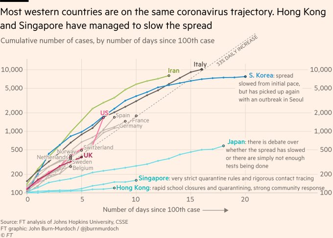
R & ggplot2
- ggplot2 is a plotting library based on Leland Wilkson's The Grammar of Graphics [9], and its usage will be familiar to any regular readers of The Financial Times for followers of John Burn-Murdoch. This is probably the go-to choice for anyone who uses R on a regular basis. See:
-
Julia & Plots.jl
- Julia is an incredibly interesting, new-ish language designed for scientific computing. The Plots.jl plotting library lets users create high quality plots using a range of backends that each have different use cases, and would probably be where I would start if I were diving into a greenfield project in this space.
Beyond these, there exist an enormous number of other popular options, from Tableau and SAS to Power BI and Grafana. However, I think in the sectors I'm familiar with, Excel, MATLAB, and Python/matplotlib must dominate the popularity statistics.
Plot Type Selection
Before you pick which plot type to run with, consider what you're trying to identify or consider in the dataset. Broadly speaking, I see five main cases, where you're seeking to identify or explore one of the following:
The basic set of charts for these cases are listed below. To provide something like a real-world example in each case, I've managed to get some sim racing data from the wonderful Andreas Kociok. For the motorsport fans reading this, the data is from a run in an Oreca 07 in rFactor 2
I've tried to keep the plots as simple as possible to start, so there are no real considerations of colour, marker, line type etc. being made.
Trends
If you're working with a dataset where you want to identify a trend or show the evolution of one or more dependent variables against an independent variable that is (normally) monotonically increasing, e.g. with timeseries data, choose:
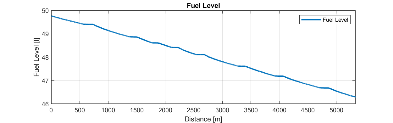
Line/Area Charts: Best for showing trends over time, highlighting the flow and direction of the data.
These are probably the standard, go-to plot for most scenarios—at least to start. If you want to see how something changes over time, or over some other independent variable, this is where to start. In our example, look at how fuel level drops over the the course of a lap. At first glance, this is basically just a straight descent, but you can also quite readily infer the change in gradient throughout the lap as the fuel flow rate changes under different conditions.
Relationships
If you want to examine or demonstrate how one variable relates to another, e.g. to get a visual indication of correlation, choose:
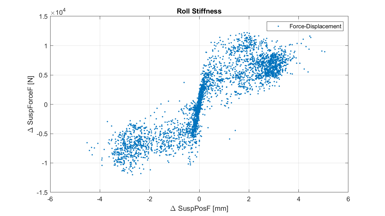
Scatter Plots: Best suited to larger series, and used to identify how variables correlate with each other.
Another staple: these plots can be incredibly useful in getting a handle on relationships, and are often the starting point for more complex analysis. In our example, we use one to examine the front axle roll characteristic of the car—this is effectively a force-displacement plot, and as a result, the gradient of the line tells us about front axle roll stiffness. For me, this plot is interesting because of the sort of inverted Z shape visible in the data. At higher roll load, the car appears to be less stiff in roll—something we can dig into in Part 2.
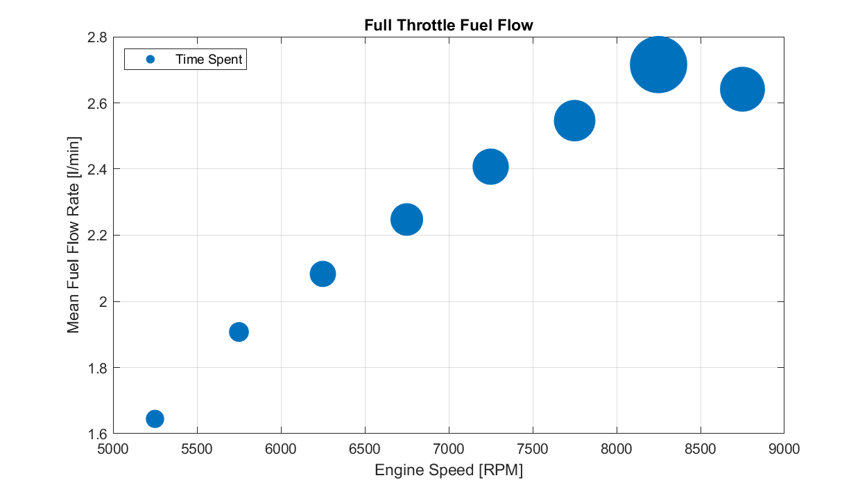
Bubble Charts: A variation of the scatter plot, where the size of the bubble can represent an additional variable or dimension.
In our example, we use a bubble chart to show how full throttle fuel consumption varies with engine speed, but we then use the bubble size to provide an indication of how much time is spent in each engine speed/fuel consumption region.
Distributions
If your focus is understanding the range and distribution of a dataset, choose:
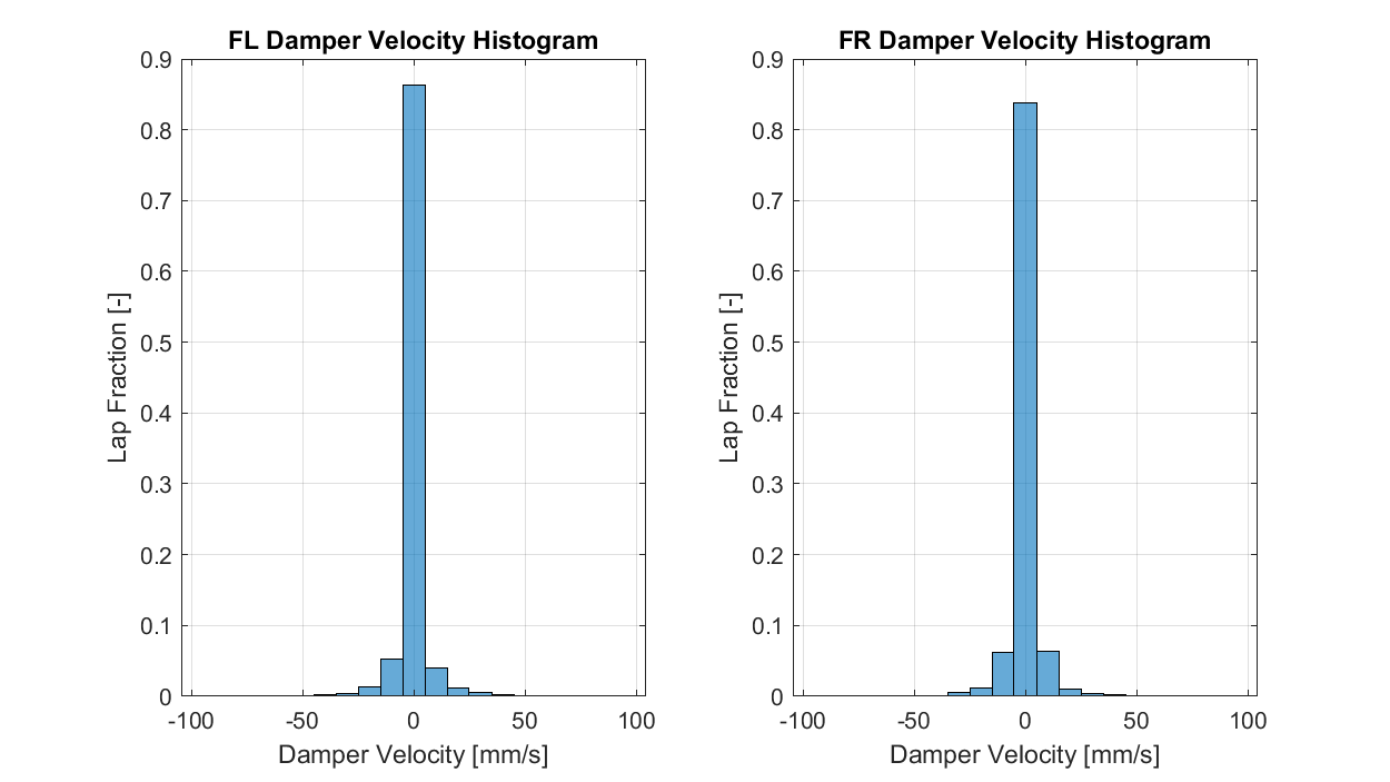
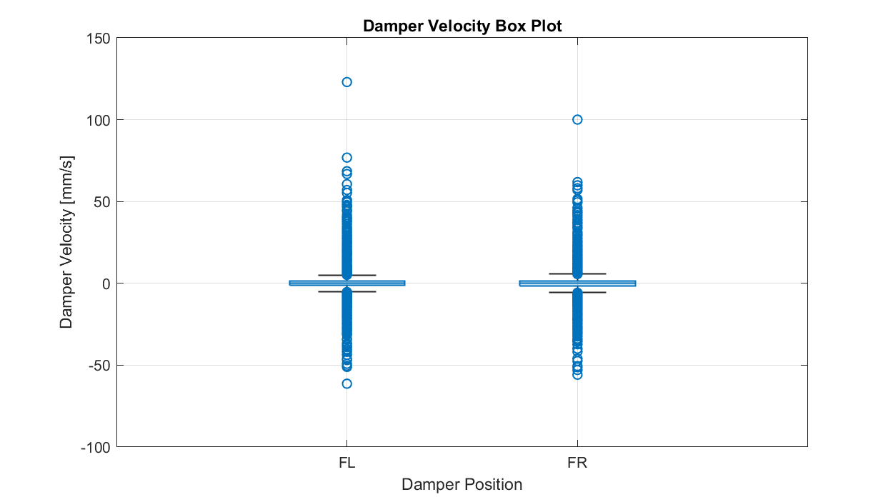
Histograms: Ideal for showing the frequency distribution of a single variable.
In our example, we use a histogram to show the distribution of front suspension velocity over the course of a lap. I've labelled these as 'damper velocity', though given the provenance of the data, I don't actually know what the channel I've differentiated here represents. Plots like this are used for identifying how much time or energy or whatever is spent in a particular range of values, and can be useful for identifying outliers, asymmetries and other anomalies.
Comparisons
If you want to compare different categories or groups within your dataset, choose:
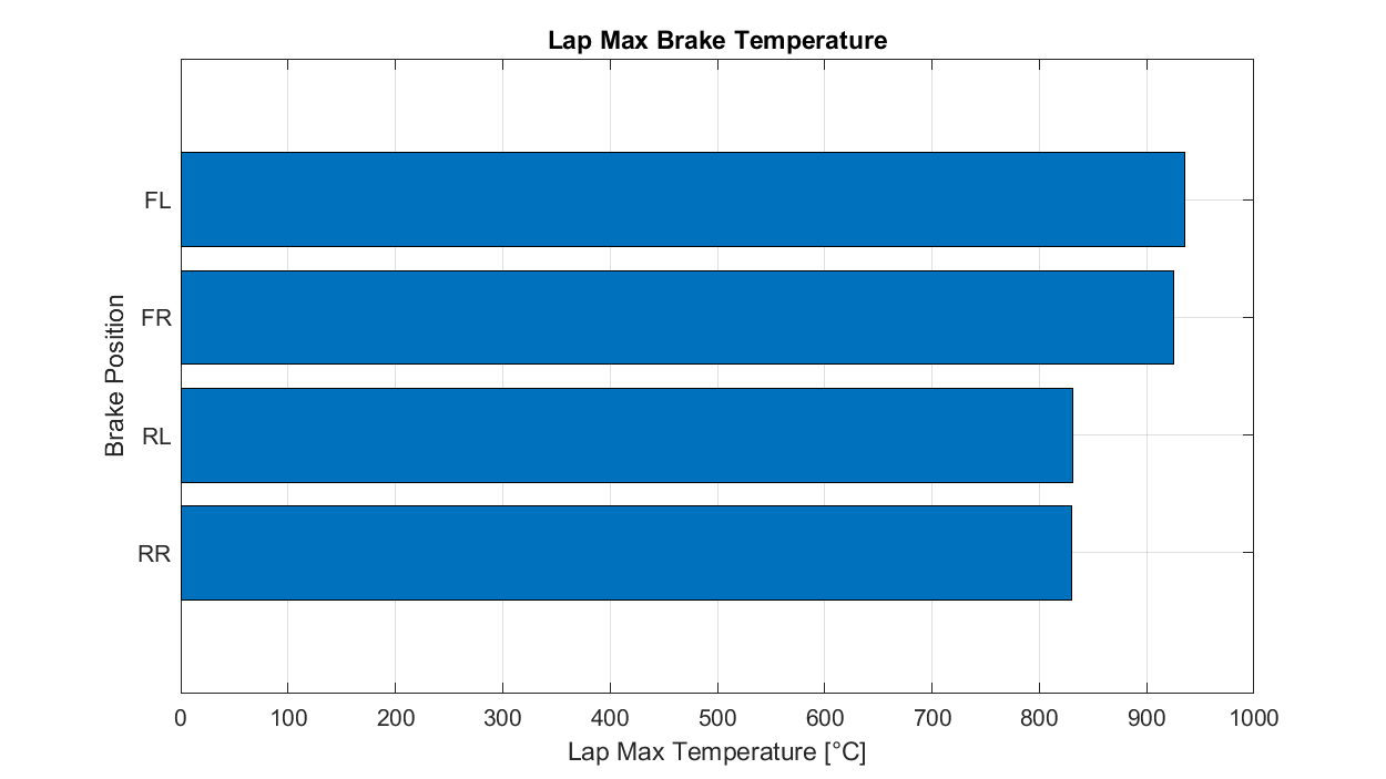
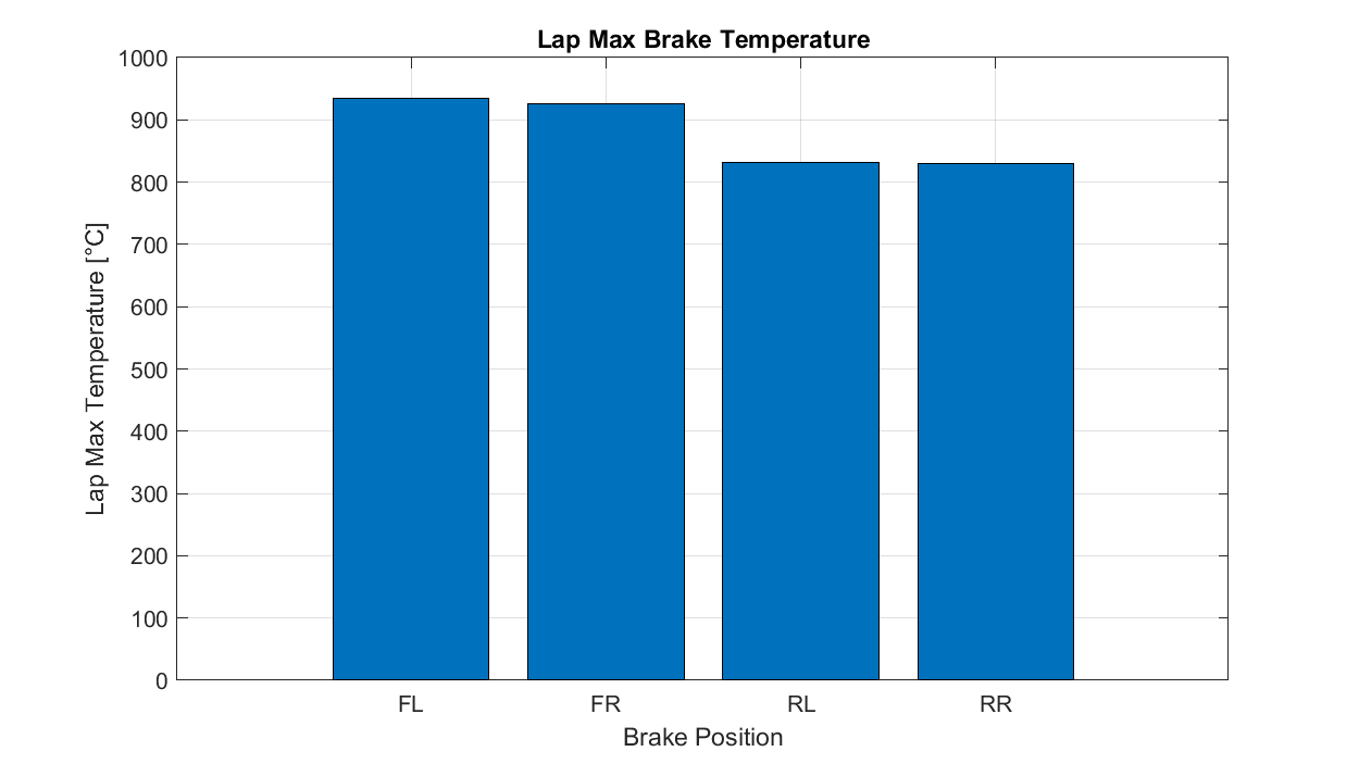
Bar Charts: For comparing quantities across different categories; also known as a horizontal bar. I see many of these that could have been simple line plots, and colour selection that makes things more rather than less confusing—but we'll address that in the next instalment.
For our example, we'll look at lap maximum brake temperatures.
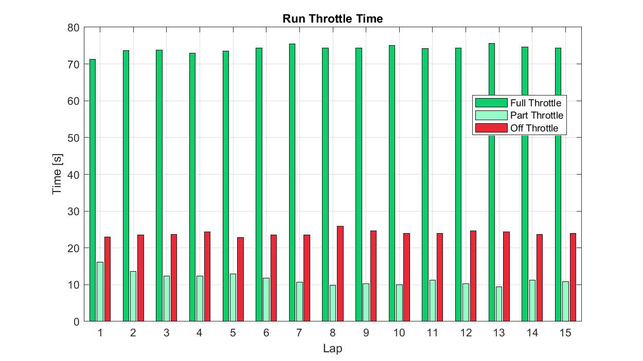
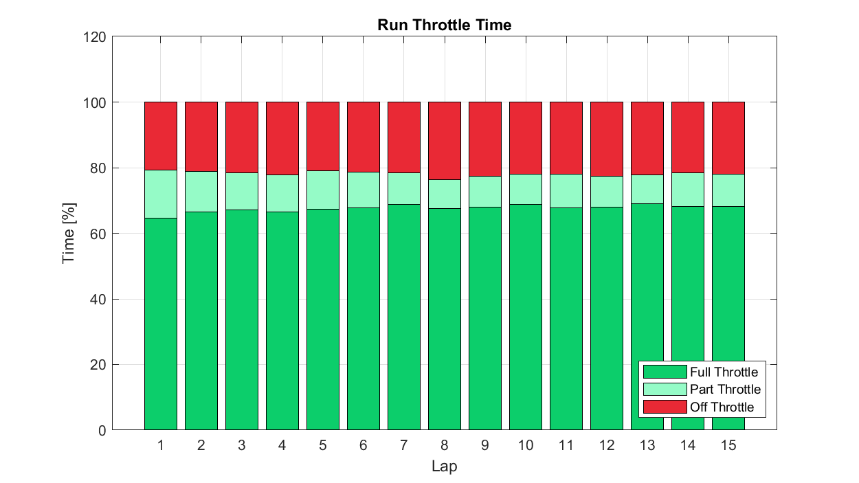
Grouped Bar/Column Charts: A grouped version of the charts above, with different categories shown side by side. These are useful for showing variation and evolution in values within each category.
Though this might be clearer as a line chart with three series, we can use this plot type to look at what amount of time was spent in the full, part, or off throttle (pedal) condition across a run of multiple laps. In the plot, we can see that absolute part throttle time falls to a minimum around Lap 10, while full and off throttle time have less pronounced trend over the run.
Compositions
If you want to illustrate how different parts make up the whole of something, choose:
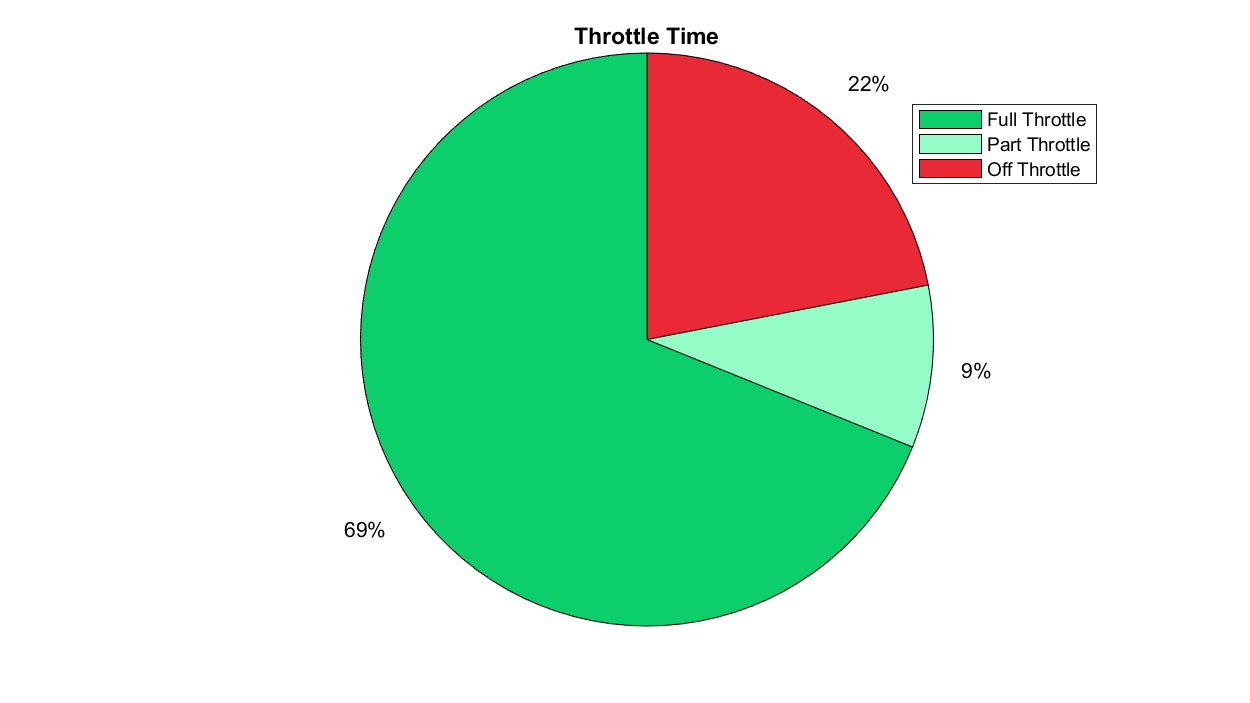
Pie/Donut Charts: Used to show how parts of a whole are divided.
I generally don't think there are many good use cases for these, but the exceptions are where:
- You want to convey that one segment is particularly small or large relative to the others.
- You want to convey a general idea of how a small number of categories make up a whole, without a need for precision.
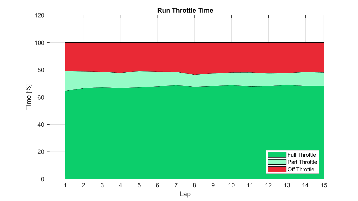
Stacked Bar/Column Charts: Used to display cumulative totals of categories and the contributions of individual components, particularly across another dimension.
For our example case above, we could imagine wanting to compare 'normalised' lap throttle time statistics across a run, perhaps as tyres were degrading or fuel load reducing. A series of pie charts would be incredibly hard to interpret with any accuracy, but a stacked bar should give us what we need. In this case, we can immediately see that Lap 8 was that with the lowest part throttle time fraction, and we can readily compare these fractions across the laps.
References
- [1] https://www.ncbi.nlm.nih.gov/pmc/articles/PMC6407691/
- [2] https://www.mpg.de/8849014/hierarchy-senses
- [3] https://www.ncbi.nlm.nih.gov/pmc/articles/PMC6777262/
- [4] https://assileye.com/blog/is-sight-the-most-important-sense/
- [5] https://www.bbc.co.uk/news/av/technology-34943089
- [6] https://www.opb.org/article/2023/09/12/think-out-loud-making-data-more-accessible-by-turning-it-into-sound/
- [7] https://en.wikipedia.org/wiki/Data_sonification
- [8] Visualizing Streaming Data
- [9] The Grammar of Graphics